Sit back, open the eyes of your imagination, and enjoy a little allegory about soda cans and the power of imagery and brand.
Once upon a time, in a land not too far away, there was a soda can named Coca-Cola (also known as Coke) who was quite popular and very admired by her fans.
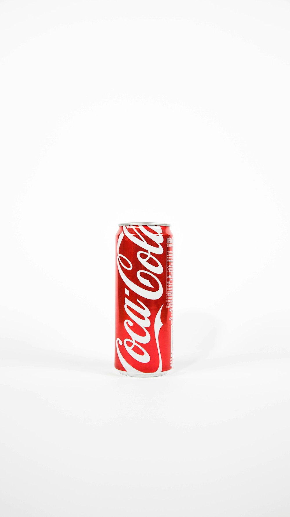
Coke wore a stunning yet simple red design over her aluminum exterior. The script typestyle in her name was an iconic symbol, easily recognized by young and old alike, far and near, and in every corner of the world.
Ask any of her admirers, and they will tell you the red Coke can evoke feelings of happiness and refreshment as they anticipate the tingly tickle in their nose and mouth when they guzzle the sizzle-y, bubbling liquid, and the ensuing rush of sugar and caffeine.
For many, their minds are filled with images of delicious pizza, barbecues, burgers, and other fun foods at gatherings where Coke runs free and a-plenty.
Now…Coke has worked very, very hard to make this happen. The thoughts and feelings that suddenly overcome her fans are not accidental.
But one day, her friends and advisors urged her to change her iconic red can to a white can.
It was time for a refresh.
A redesign.
A strategic disruption.
And, they would tie it to a good cause and attract even more admirers.
Unfortunately, it only caused great confusion and chaos amongst her fans. Many stopped buying it. Many others claimed that the taste was off, and it was not the same product.
Coke quickly went back to red cans. And people were relieved and happy. They bought even more Coca Cola and sang the praises of this delicious beverage and the beautiful red can they were so accustomed to seeing.
But a funny thing happened next.
Other soda cans took notice of this surge in Coke’s popularity, and thought if they also changed their color to red, they would experience the same popularity and attention.
7-Up was up first. They changed their bright green-and-silver can that prepared people for a lemony-lime experience to a red-and-sliver can with only a touch of green.
Then Orange Crush thought they would #crushit if they also jumped on the bandwagon. That juicy image of an orange slice was thrown against a red background instead of an all-orange background.
Even Dr. Pepper failed to use his doctorate degree to think first before diving in, and changed his deep burgundy can to a bright red.
All the visual anchors that helped people understand and make decisions were suddenly upended.
Mayhem and confusion ensued.
And people stopped buying until they could reorient themselves and restore peace and order to their soda pop world.
What these aspiring soda cans failed to realize was that the power of Coke is not just the color of the can, but the brand that they’ve worked hard to build.
The red color is how people identify Coke and all the attributes, benefits, and emotions connected with it. It is tightly associated with the whole brand appeal.
Simply changing your appearance without changing your brand appeal and message (the words, feelings, and thoughts you evoke in your market) will cause confusion and weaken your brand identity.
So….
What’s the point of this story, boys and girls?
To show you that your brand isn’t just how your stuff looks. It’s not just your logo, your website, your fonts, or your business card. Your brand is tightly tied to your message and your position in your market (how your market perceives you). If your message is dull and sounds like everyone else’s, no amount of uh-mazing design will help. A cool, unique design might help get attention, but it won’t keep their attention.
The key to rebranding done right is for the redesign not to be for the sake of redesign, but to position yourself directly for your audience and create a dedicated space for partners and contributors to shine. The styling should be strategically chosen to evoke a specific “feel” and “experience.”
Whether that “feel” is scholarly, rich, educational content, or an intimate and personal experience, either way the design should make you unique and likable — allowing an authentic interaction with your following.
So if you’re considering a rebrand, start with your message, not with your logo.
P.S. The soda can story is a fictional allegory, inspired by a true story. Google “Coke changes can color to white.”